
A Guide to Pantone Matching System (PMS) for Custom Boxes
Achieving exact brand color reproduction across custom boxes requires more than digital artwork. From comparing CMYK process printing with pre-mixed PMS spot colors to managing coated versus uncoated paperboard absorption and protective lamination shifts, this technical guide demonstrates how to leverage the Pantone Matching System to ensure flawless color accuracy on every packaging run.

Awais M · Custom Packaging Specialist
Awais M helps small and mid-sized brands get custom packaging right — the box style, the material, the print finish, and the order quantity that actually fits the budget.
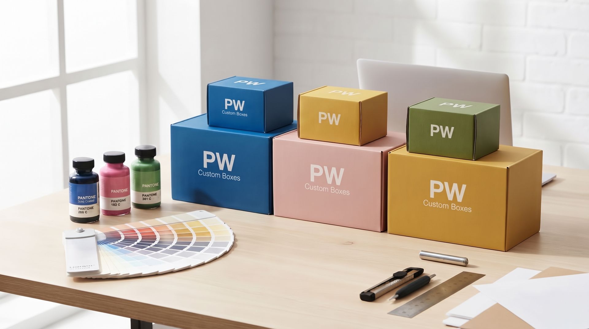
Whether you are launching a luxury retail cosmetics line, scaling a consumer packaged goods (CPG) brand into target retail stores, or delivering high-end e-commerce subscription boxes, your brand color is your primary visual signature. Consumer packaged goods brands, luxury cosmetics houses, and scaling retail businesses across the USA rely on instant color recognition to build consumer trust and dominate competitive shelf space.
When ordering custom retail packaging, these brands expect absolute, flawless color consistency from digital artwork submission to physical box delivery. A faded logo, an off-shade background tint, or batch-to-batch color shifts can degrade brand perception and trigger costly production rejections. Standard four-color process printing often falls short when tasked with reproducing precise, solid brand hues across different packaging runs and paperboard stocks.
To overcome these printing variances, professional packaging engineering relies on the Pantone Matching System (PMS). This technical guide explores how leveraging standardized PMS spot colors guarantees exact color fidelity, solid ink density, and uncompromised brand integrity on every custom box order.
What is the Pantone Matching System (PMS)?
Defining PMS in Packaging
The Pantone Matching System (PMS) is a universally standardized color identification system used by printers, packaging engineers, and brand managers worldwide. Instead of relying on digital monitor estimations or variable ink mixes on press, PMS assigns a specific code (such as PMS 185 C) to precise, pre-mixed ink formulas. This standardization guarantees that whether your custom boxes are printed in California, Texas, or internationally, your brand's signature color will reproduce with identical accuracy across every commercial offset and flexographic press globally.
PMS vs. Standard CMYK (4-Color Process)
Standard 4-color process printing relies on overlapping tiny dots of Cyan, Magenta, Yellow, and Key (Black) inks to build visual images. While CMYK is ideal for printing continuous-tone photography, it struggles with solid brand backgrounds and vibrant graphic elements.
Color Shift Risks: Minor ink-flow variations on press can cause noticeable color shifts between packaging batches.
Lack of Saturation: Halftone dot patterns leave microscopic gaps between colors, making rich, saturated hues look dull or washed out under bright retail lighting.
Limited Gamut: CMYK cannot reproduce hyper-vibrant neon shades, rich pastels, or clean corporate colors (like deep reflex blues or bright orange hues) without visual banding or color distortion.
Spot Colors Explained
Unlike CMYK process printing, spot colors use custom-blended inks mixed according to exact chemical formulas before being loaded onto dedicated press stations.
High-Density Coverage: Spot colors deposit a single, continuous layer of opaque ink onto the paperboard, producing high-density, ultra-smooth solid backgrounds without halftone dot patterns.
Zero Registration Misalignment: Because a spot color prints as a single complete ink layer rather than four overlapping process dots, text and logos remain crisp without blurry edges or misregistration shadows.
Substrate Consistency: Pre-blended formulas allow ink technicians to adjust pigment densities to overcome natural paperboard absorption, ensuring maximum color punch across every box.
Coated vs. Uncoated Pantone Guides (C vs. U)
Choosing the correct Pantone suffix is just as critical as choosing the color number itself. In the Pantone system, the letters "C" (Coated) and "U" (Uncoated) do not represent two different ink formulas; they refer to how the exact same physical ink formula behaves when applied to different paperboard substrates and surface treatments.
Pantone Coated (e.g., PMS 185 C)
Coated Pantone guides display how ink sits on non-porous, smooth paperboard surfaces.
Substrate Compatibility: Ideal for cosmetic folding cartons (SBS/CCNB), high-gloss laminated rigid boxes, bleached paperboards, and UV-coated surfaces.
Visual Performance: Because the ink sits directly on top of the smooth coating layer without soaking into the wood fibers, light reflects cleanly off the surface. This produces ultra-vibrant, crisp colors with deep saturation, maximum optical density, and a high-gloss or semi-gloss finish.
Pantone Uncoated (e.g., PMS 185 U)
Uncoated Pantone guides illustrate ink behavior on raw, porous paperboard stock.
Substrate Compatibility: Formulated for unbleached raw kraft paperboard, natural corrugated shipping liners, textured linen papers, and matte uncoated boards.
Visual Performance: When applied to uncoated paper, the wet ink immediately soaks deep into the porous wood fibers. This absorption scatters light reflection, causing the color to appear flatter, softer, and noticeably darker or muted compared to its coated counterpart.
The Substrate Absorption Factor
A common pre-press mistake is selecting a Coated Pantone color (like PMS 185 C) for an Uncoated raw kraft box. The physical ink formula used on press is identical—what changes is how the paperboard reacts to the wet ink.
Porosity & Dot Gain: Uncoated paper fibers draw the liquid ink outward and downward, creating higher ink absorption and natural "dot gain" or spreading.
Color Shift Management: To achieve a cohesive brand identity across a mixed packaging suite (e.g., a high-gloss folding carton and a raw kraft shipping container), print technicians must formulate different ink densities or select corresponding C and U targets to visually match the brand color across both substrates.
· CMYK vs. PMS Comparison for Packaging
Printing Parameter | CMYK (4-Color Process) | PMS (Pantone Spot Color) |
Ink Formulation | Cyan, Magenta, Yellow, Black dots combined on press | Custom pre-mixed single-formula inks |
Color Accuracy | High ( color shift variance) | Exact 100% color match standard |
Best Used For | Continuous-tone photographic images & multi-color art | Brand logos, solid background blocks, & strict brand guidelines |
Substrate Adaptability | Subject to dot gain and substrate color bleed | Highly controlled opacity and pigment intensity |
Cost Efficiency | Lower cost for multi-color detailed artwork | Cost-effective for 1–3 solid color brand prints |
Technical Considerations for Printing Pantone Colors on Boxes
Executing flawless Pantone printing on physical packaging requires moving beyond digital artwork software and accounting for press-room chemistry, surface finishes, and machinery configurations.
Pre-Press Proofing: Digital Monitors vs. Physical Drawdowns
Relying on computer screens to approve Pantone colors is a common cause of production errors. Monitors display images using RGB emissive light, which can make colors appear vibrant on screen but impossible to replicate with physical ink on paperboard.
Hard-Copy Ink Drawdowns: A drawdown is a physical proof created by smearing the custom-blended PMS ink onto the exact paperboard stock chosen for your box project.
Verifying Real Absorption: Drawdowns reveal precisely how the ink reacts to the board's texture, brightness, and absorption rate before full-scale production begins, eliminating unexpected color shifts on press day.
Finishing & Lamination Shifts
Post-print protective coatings are essential for preventing box scuffing during transit, but they alter how light interacts with the underlying Pantone ink layer.
Gloss UV Coatings & Gloss Lamination: These tend to enrich color saturation, making dark tones deeper and vibrant hues pop with higher contrast.
Soft-Touch & Matte Lamination: Matte films scatter incoming light, which subtly flattens color intensity, often shifting dark PMS shades slightly lighter or giving bright colors a softer, muted appearance.
Proactive Ink Formulation: Experienced press operators adjust ink pigment density during mixing to compensate for known shift percentages caused by your chosen topcoat.
Combining CMYK + Spot Colors (5-Color Press Setup)
When a custom packaging design requires both detailed product photography and exact brand color reproduction, combining print methods delivers the best result.
Split-Channel Efficiency: Running job files on a 5-color (or 6-color) offset press allows CMYK process inks to handle detailed imagery and gradients on four channels.
Dedicated Spot Channels: The 5th channel is reserved exclusively for a mixed PMS spot ink. This ensures your logo, brand name, or solid background maintains 100% color accuracy and density without interfering with the CMYK photo channels.
Key Takeaways
Guaranteed Color Precision: Using Pantone Matching System (PMS) spot colors eliminates batch-to-batch color variance and provides rich, solid ink coverage that standard 4-color CMYK process printing cannot match.
Coated vs. Uncoated Guidance: Always match your Pantone suffix to your packaging substrate—select Coated (C) for smooth clay-coated or laminated folding cartons, and Uncoated (U) for raw kraft or porous corrugated stocks.
Require Physical Drawdowns: Never rely on RGB computer monitors for final color approvals; insist on physical ink drawdowns on your actual paperboard stock to verify ink absorption before mass production.
Factor in Protective Coatings: Account for finish-induced light reflection changes—gloss coatings increase color depth and contrast, while soft-touch matte laminations soften saturation.
Optimize via 5-Color Printing: Combine CMYK for continuous-tone product imagery with a dedicated 5th-channel PMS spot color for critical brand logos and solid background blocks.
Contact the custom print team at sales@thepackagingworld.com to request custom sample kits, order physical ink drawdowns, or get an instant bulk pricing quote today.
Need custom packaging for your product?
Get pricing, samples, and expert advice — no commitment required.
Topics
Industries